How Can We Impact Well-Being?
Using Machine Learning To Find Out Where To Start
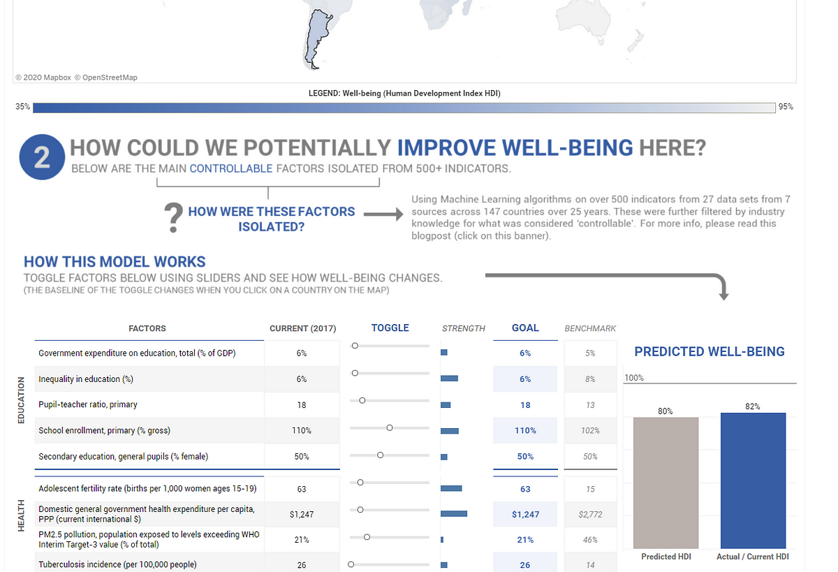
I did an immersive Data Science boot-camp to learn how to better use data to help solve poverty. This dashboard (fancy, huh?) was the output after combining 27 data-sets from 6 different sources, and building an inferential (sometimes predictive) machine learning model using Python, Tableau and good old Excel. Ta dah!
If you’re in the social impact / non-profit space and / or into data, this post outlines how (and why) I went about doing it. It is long and it gets pretty technical, but I hope to make it worth your while.
If you’re like “No, screw that!” and just want to see what the findings are from this, skip right to the end and have a look at the findings and the limitations of this model.
For Coders: Here’s the GitHub link with all the code, the data and the Tableau dashboard file if you’re keen.
Disclaimers
If you did give the dashboard a gander, some alarm bells might have gone off. That’s fair. No, I’m not claiming to have solved poverty through this dashboard, nowhere close. And there are a lot of assumptions and disclaimers and imperfections that engulf everything about it. That also just happens to be the inherent nature of the impact space — it is really hard to define and measure “impact.”
But that doesn’t mean we can’t try.
The Setup (The “Why”)
Data is the future of decision making, I believe.
This belief drove me to London this past year to do a three-month immersive boot-camp in Data Science through General Assembly.
I already, sort of, know what I am going to do with my life — I want to focus on tackling multidimensional poverty; first through my own social enterprise, and then, if that fails, through whatever makes the most sense.
After spending the last two years working for non-profits, it dawned on me that the impact space, on average, just doesn’t have enough technical expertise. I remember one of the organizations I worked for hired a Fellow and gave him the email address “fellow3@company.org”. I was “financefellow@company.org”.
We have a lot of heart, but we don’t have enough engineers, data scientists, finance experts, graphic designers and other technicians who are integral to operate any type of organizations efficiently.
I did not want to be that cliche. I like data and if I was going to start a social enterprise, I wanted to be at the edge of the latest in tech versus lagging behind.
The Problem
There are over 1.3 billion people who are in multidimensional poverty. What does this “multidimensional” thing mean? Just that — there are multiple dimensions to the concept of poverty — health, education, living standards and the often immeasurable dimension, dignity. This is not as simple as extreme poverty which broad-strokes every person who makes less that $1.90 a day.
How can we tackle this problem as quickly as possible? Poverty has significantly reduced over the last few decades, but there is still a long way to go. So, how can we expedite this process?
There is a lot being done by multilateral organizations (UN, World Bank, IMF), governments and through the contentious way of CSR (still counts though).
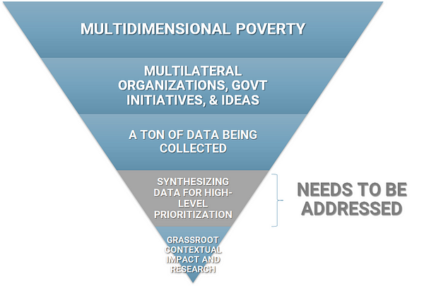
There is also a lot of data being collected by these players — it isn’t necessarily clean or easy to collect, but there is data out there.
My hypothesis though is that there isn’t enough synthesis of this high-level global data. As you can see from the upside down blue triangle above, this is the gap that needs more attention. This is what even the effective altruism movement understands to be true — global priorities research is one of the most pressing problems of the impact space.
So, based on all the global, macro data that is out there, what controllable factors have the highest impact on multidimensional poverty? And can I use machine learning to find any meaningful relationships in the waterfall of data that is out there?
I ran this problem statement by a focus group of key players in the impact space — social entrepreneurs and impact investors — who had some skin in the game. Their gut reaction was, “Wait, what?”
There was a strong belief that the answers are in the field, not hidden in some badly-collected global data. I don’t disagree with that. Whatever the data says, interventions need to be tested locally before large scale implementation, especially because most of the time, lives are at stake.
And then there is the “transferability” of the findings — just because it worked in the past or in Kenya, doesn’t mean it will work today or in India. And I’m not arguing against any of that.
But what if this “badly-collected” global data gave us starting points? What if they gave us hypotheses to test that were better than just intuition or anecdotal evidence? Can we leverage the power of the machine to tell us something that our brains can’t physically calculate?
The Idea
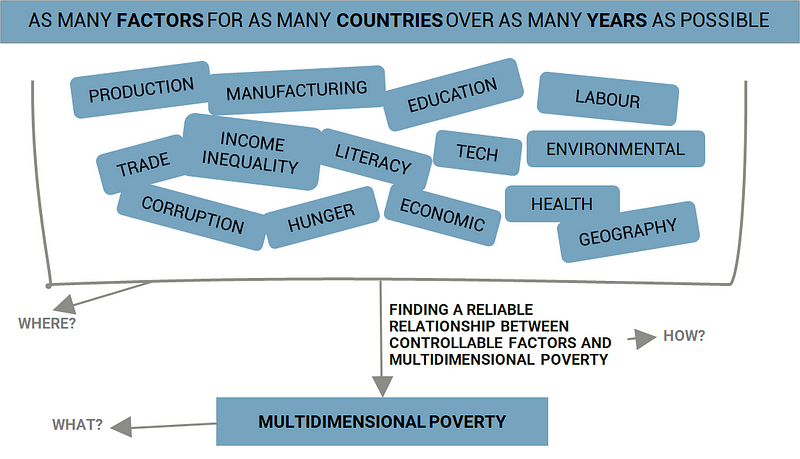
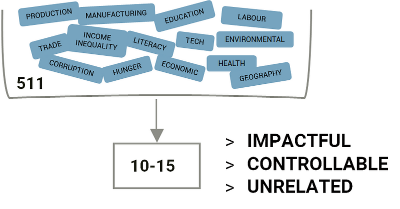
So, the idea was to take all (or as much as I could) of the macro data available out there for as many countries spanning as many years as possible, use regression models (machine learning) to isolate the 10–15 most potent factors / indicators and see if I could use machine learning again to build an inferential relationship between those isolated factors and multidimensional poverty (see above diagram). And then, when I had that relationship, to create a dashboard of sorts that could actually be used by a non-technical user.
Sounds straight-forward, right? In theory maybe, but I had to figure out a lot:
A) What the target variable for multidimensional poverty would be. As in what metric am I predicting / trying to understand?
B) Where I could find all the factors or data that impacted this poverty metric (and how to merge and clean it when I did find it).
C) How to find a reliable relationship between these controllable factors and multidimensional poverty.
D) And how to friggin’ put all that into a fancy usable dashboard.
A) Deciding The Metric To Use For Multidimensional Poverty
The UNDP has an index for multidimensional poverty called the Multidimensional Poverty Index (MPI). You’d think I would just use that, right? Yes, that was the plan. But there are not enough years of data associated with it, not enough countries covered and it’s also complicated to calculate. Scratch that.
I could use Extreme Poverty — it’s easily available with a lot of data points but then it is one dimensional, and goes against everything that I stand for. Scratch that too.
Then I came across the Human Development Index (HDI) and there was a feeling that Jesus had returned. It was multidimensional in that it considered education, healthcare and income (close enough to MPI), there were many data points associated with it across many years and countries and it was fairly easy to calculate. Yes, it did not measure poverty specifically, but it did measure well-being, and yes it isn’t a perfect metric, but let perfect not be the enemy of good.
Ta dah! Sometimes all you need is a little rationalization.
B) Finding The Data (And Cleaning It)
Next, I had to source the data from all over the world wide web. And source it I did. I had to actually stop myself at some point because this process of data gathering can be endless. In the end, I collected data from 27 data-sets from 6 different sources that spanned over 59 years across 147 countries (mas o menos) incorporating some 800 factors / features / indicators.
For Python Coders: There is a cool World Bank data wrapper you can use to do massive data pulls in Python itself. Also, you can find all the data I collected, cleaned and merged, along with the code, here (the Jupyter notebook is called “A — Merging Data”).
Sounds impressive, I know, but there was also a lot of junk in there as well — a lot (A LOT) of null values, a lot of skew, duplicate factors and factors that were highly correlated (closely related to each other). As all data scientists know, all that had to be dealt with. And it’s not always a fun process, but it’s pretty damn important.
I used Python and Excel to clean and merge the data — that wasn’t that hard. The null values however, were the cancer in my data set.
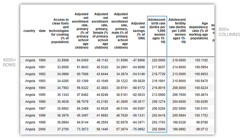
After merging and cleaning (somewhat) the data, this is what it looked like:
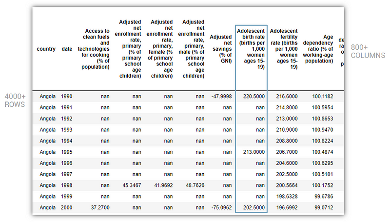
It had over 800 columns and 4000 rows but as you can see, also a lot of null values. The problem with null values is that if any row or column has a null value, it’s not friendly with machine learning. You either drop the null values (and hope that there is enough data left behind) or you try and populate it intelligently.
I had so many null values in my data set that if I dropped all null values, I would lose all my rows and columns, i.e. all my data. That’s no good.
So in order to give my project hope, I had to impute values with some logic. Thank god for Machine Learning. I used the power of machines to generate approximate values for those damn null values based on other information that was available for each country. It was a pretty complicated process, but this is what the same sample as above looked like after the imputation process:
Now you’re probably thinking, “Wait, WHAT? Did you just create data out of thin air? And you’re going to use this fake data to solve poverty?”
Yes, a red flag for sure, but there is a solve for it. As long as we are using true data to measure the accuracy of our machine learning model (i.e. as the “test” set), we mitigate the risk of the imputed data leading us sideways. More on this as we proceed.
For Python Coders: Sklearn has an incredible iterative imputer that is still in its experimental stages, but for my intents and purposes, it worked flawlessly. The sklearn docs for the imputer can be found here and you can see how I used it on my Github here (it’s in the Jupyter Notebook “B —Imputing Missing Values”). For the imputation process, I had to extract data for each of the 147 countries and impute values for each country. The above file also has all the functions associated with that process.
After cleaning, merging, imputing and dropping nulls (that were not even imputable), my final dataset was a tidy 1,353 rows x 513 columns that spanned 28 years across 46 countries and had over 500 factors / features.
C) Isolating Top Factors And Finding An Optimal Relationship (Model) With Well-Being
Now that we had the data, it was time to get into the heart of data science. The first part of the process was to isolate the top 10–15 factors. Why? Because if I was going to build a dashboard for a non-coding user to use, it could not have 500 factors to toggle. That would drive the user clinically insane, but more importantly, away from my dashboard. So I had to dwindle the factors down. How?
The criteria I used to filter down these factors were threefold:
- Impactfulness (if that’s a word): How strongly correlated are the factors to well-being. For instance, is corruption more (inversely) correlated with well-being or is unemployment? I used machine learning algorithms to rank the impact of each factor.
- Controllablility: Can an entrepreneur or an individual actually impact this factor within reason? I didn’t use any fancy data science for this, just my intuition. Magic also has its limitations.
- Un-Relatedness: The factors could not be heavily correlated to HDI (the wellbeing metric) and to each other. Because if they were, that would be cheating / too easy.
For Python Coders: To distill the impactfulness of the factors, I was restricted to using those ML algorithms that were inferential, i.e. those that either gave me coefficients or feature importance. So I couldn’t use neural nets or KNN, but I ran a hole sleuth of regressors that were inferential— Lasso, Ridge, Elastic Net, Decision Trees (piled on with AdaBoost) and Support Vector Machines.
My target variable was HDI and my X (predictor matrix) comprised all the 511 factors that we had in the dataset. My test set consisted mainly of true (non-imputed) values which mitigated the risk of the imputed data contaminating the model.
After running all the models, the best one happened to be LassoCV (which happens to be the case more often than not) which gave me a R2 score 0.94 on the test set and a score of 0.98. Since the data I was using is annual, I also ran a time-series cross validation which gave me a test score of 0.97. So, all in all, the model was looking good.
You can find this on my Github project page here (it’s in the Jupyter Notebook “C — Picking Predictors & Final Models”).
This was an super iterative process. I ran many machine learning models and each time, they surfaced a new factor or two that was either highly correlated to the components of HDI (eg. GDP is highly correlated to Gross National Income Per Capital which is used for calculating HDI) or something that was not necessarily controllable (not sure how an entrepreneur can change Land Mass unless you’re Dubai and can build islands). So, I had to drop those factors and run the models again. And again. And again.
The other issue was that 10–15 factors were too little, so in the end, after a massive Mulan-esque struggle in which I went down a black hole for a quite a while, I narrowed down the 511 factors to the following 19 factors that somewhat met the criteria I had highlighted earlier:
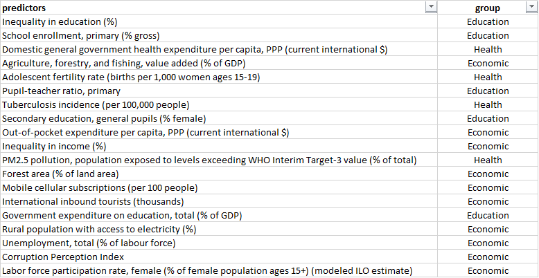
These factors / predictors are by no means perfect, and you can plug and play other factors as per your fancy, but for this exercise, these seemed workable.
Okay now on to part 2 of this step— building the final models using these 19 isolated factors.
As you are very aware by now, we are trying to predict well-being using Human Development Index (HDI) as our target variable. It’s important to understand how HDI is calculated.
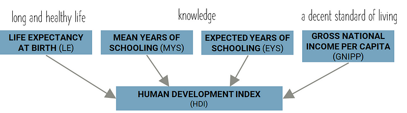
HDI is made up of four component metrics — Life Expectancy at Birth, Mean Years of Schooling, Expected Years of Schooling and Gross National Income Per Capita. There are some mildly complex formulas that are used to take these component metrics and calculate HDI, and you are more than welcome to explore that by going here.
The goal was to predict each of these component metrics and then use those predictions to calculate HDI. This would be the basis of building the final model with the isolated (“top”) factors. It would incorporate 4 mini-models for each of the component metrics that would then link to HDI. Something like this:
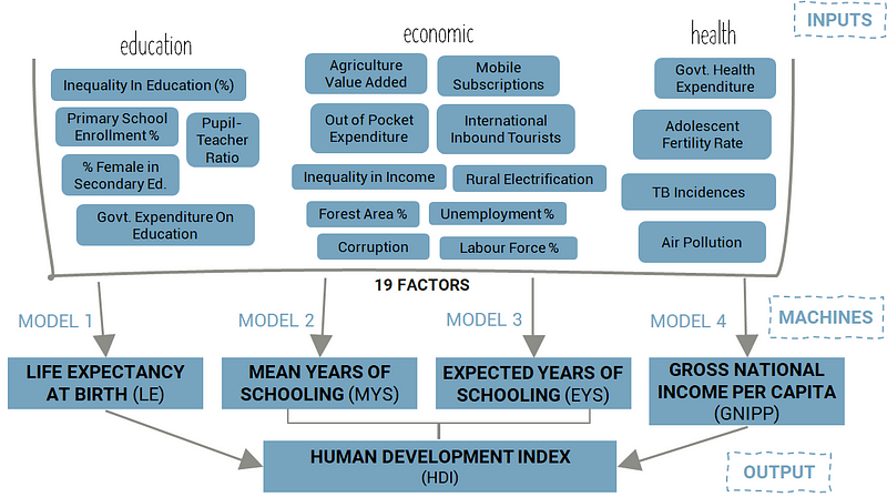
It was time to model!
For Python Coders: A guardrail here was that I could only use one type of machine learning algorithm. This is because whatever output I got, I had to be able to export it into Tableau to be able to create an interactive dashboard. Since I didn’t have Tableau Server and was using Tableau Public (FREE!!) to build the dash, I couldn’t use TabPy (a library / tool that allows you to run Python code on the fly and display visualizations in Tableau). TabPy (as of the writing of this post) only works with Tableau Server which costs $$$. Which basically meant that I could only use only linear regression models, because linear regression gives me an equation. Once I had the coefficients and intercept of this equation, I could export them into a CSV and use that to build the same linear regression equation in Tableau. Yes, this was complicated and yes, I wish TabPy worked with Tableau Public.
But you don’t give up, you adapt.
For those who are not familiar with machine learning, a common metric used to evaluate a machine learning model / algorithm is called R-squared (R2). Feel free to read more about it, but what you need to know for this post is that a R2 score of 1 means that the model is perfect and 0 means that it sucks. So we want a R2 score of something close to 1.
After building, tweaking and optimizing the machine learning models, these are what the final scores of my model looked like:
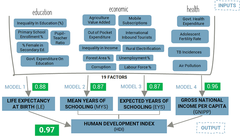
Healthy model, right? Woohoo!
If you’re wondering why the component models have lower scores than the final score for HDI, it’s because those components are used to calculate other indices which are then weighted to calculate the HDI, and in that entire process, our models fare fairly well after abstraction.
For Python Coders: The above scores in green represent scores on the test set that comprises true values only (non-imputed values). This is done to mitigate the risk of using imputed values in my training data.
I used LassoCV again for each of the four component models (Life Expectancy, Mean Years of Schooling, Expected Years of Schooling and Gross National Income Per Capita). I further optimized these models using GridSearch. I had to reduce the skewness of some of the factors / features and did so by essentially logging the highly-skewed factors. Factors were “highly-skewed” if their skew was greater than 1.
Once the four models were tuned, I used their predictions to calculate HDI as per the UNDP formula. I then ran the calculated HDI numbers against the actual HDI numbers and it gave me an R2 score of 0.97. And all in all, the score was pretty dandy.
You can find all this in more detail on my GitHub project page here (its in the Jupyter Notebook “C — Picking Predictors & Final Models”)
The model was built. The score was good. It was now time to export this model into a fancy Tableau dash.
D) Taking It All Into Tableau To Build An Interactive Dashboard
The goal of this dashboard is to put the power of machine learning into the hands of a user who doesn’t really know how to code. If I could give my target audience a dash which was somewhat intuitive to use, the machine learning model I built would be a lot more scalable.
So who is my target audience? Social entrepreneurs, primarily, and other folk that work in the impact space would be secondary.
How would this be useful to them? Maybe this would give my target audience a tool they can use to see how different controllable factors impact well-being. For instance, if they reduced corruption by 5%, what could the approximate impact on well-being be? Or if they increased rural electrification to 100%, how would their chosen country’s well-being change? All this would be based on data that spanned over 28 years across 122 countries* of all type, and it would be driven by a relationship that was calculated using machine learning that humans wouldn’t be able to do in their head (or by hand, or easily in Excel).
Obviously, this isn’t a perfect relationship. But as I mentioned earlier, it is something that they can use as a starting point for their local grassroots research. That’s how I am going to use it.
It is relatively easy to make sexy dashboards in Tableau because well, it’s a point-and-click software. But, because of that, it’s also pretty rigid. And because I used the free, public version of the software, there were some limitations on how much funky stuff I could do.
Essentially, I had to export the machine learning model from Python into a format that was digestible in Tableau. I also had to build the dashboard in such a way that I could take in information (or inputs) from the user. I wanted to give the user toggles they could toggle and see instantly how changing a factor would impact well-being.
After a lot of toil, this was the final output (that you might or might not have clicked on in the beginning). If you’ve made it all way till here in this post, I hope you do have a gander, and if you have any thoughts, don’t hesitate to share them. It’s not perfect, it’s a little clunky, but it might be useful. And if it is (or is not), let me know (or not know).
I learnt Tableau by myself — it isn’t too hard if you’re willing to give it time. There are a lot of YouTube videos that are helpful, and Tableau also themselves host a bunch of training material that might be a good place to start. You can find the working Tableau dashboard file I used on the GitHub project page.
For Python Coders / Tableau Experts: As I said earlier, I was limited by Tableau Public. If I had Tableau Server, I could have used TabPy and leveraged more complicated models. In the end though, my scores were pretty decent so I’m not fussed. The .twbx file for the dash is on the GitHub page for this project. Enjoy!
Findings
I am about to become a social entrepreneur. So I was pretty much the target audience for this dashboard. I learnt a ton. It might seem a little controversial up front, but you’ve got to realize that this is not perfect; it should merely serve to narrow the starting point for further local, grassroots research.
- Rural electrification could be a game-changer. As per the model, it seems to have highest impact on well-being. For India, if we increase rural electrification from about 77% to 100%, we could see a two point increase in overall well-being.
- Governments need to spend more on health care. This was also strongly correlated to well-being. For India, if we triple government health care spending per capita, we would increase well-being by two percentage points. This seems small but currently India spends very little per capita on its population (~$61) versus most high-income countries who spend an average of over $2,500 per capita.
- High adolescent women (15–19 years) fertility rates have a strong negative impact on well-being. This seems obvious and as expected, had a high level of importance for well-being. It’s important to reduce teenage pregnancy.
- We need to focus less on agriculture. An increase in value added by Agriculture, forestry and fishery could lead to a decrease in well-being as per the model. This might seem a little controversial, but it highlights how the world is moving away from an agrarian society towards more of a service-based one.
- Lack of sufficient primary school enrollment and inequality in education are real barriers to well-being. No surprise here, education is everything — it’s just that it takes a generation or more to impact change through this.
- Relying on governments to spend on education might not be the answer. Again, a little controversial, but it seems like government spending on education is inversely related to well-being. Note that as per the model, it is not a significant predictor so it does not impact well-being very much on the whole.
- Unemployment, labour force participation rate and inequality of income might not contribute as much to well-being as I thought they would. As per the model, these didn’t impact well-being much at all. This was a bit of a shocker for me because this is what I want to focus on. I need to reconsider how impactful working on unemployment and job-creation really is.
Limitations
As I have mentioned over and over again in this post, this is not a perfect model by any means, and it should serve, if anything as a starting point. Apologies for being a broken record, but it’s important to not make sweeping conclusions from what this model spits out. And here’s why:
- The model currently generalizes across countries and dates which can be improved with more complicated models (think Bayesian Multivariate Time Series). Along these lines, this model could suffer from Simpsons Paradox, which basically means that what is true for all countries might not be true for a specific country.
- Other factors (outside of the 19 that were isolated) could have been used to build this model with similar (but not necessarily the same) levels of accuracy.
- HDI is not a bullet proof metric to measure well-being. There have been contradicting findings around the usefulness of some of its components such as Years of Schooling and Life Expectancy.
Next Steps
Remember this upside down triangle?
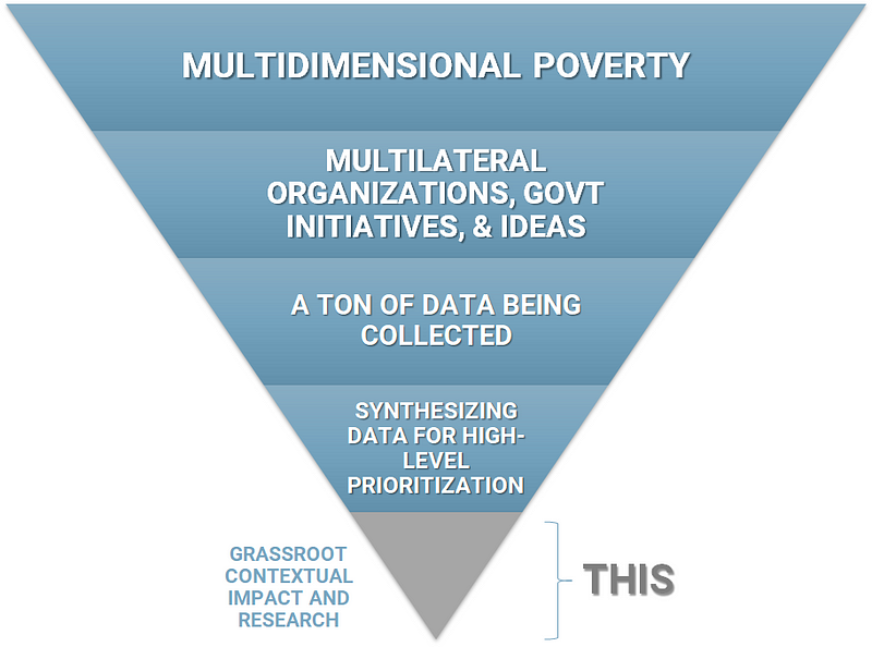
I feel I’ve given the “synthesizing data for high-level prioritization” a fair amount of time. I need to now use what I have learnt from this exercise to figure out how I am going to go about doing grassroots research here in India.
There is already a ton of that taking place in India and around the globe. This local approach is arguably the most useful and impactful, especially when it comes to deep, long-lasting change. The likes of J-PAL, IPA and Evidence Action are conducting some incredible randomized control trials that are changing the way we approach positive change-making at a local level. Many grassroots non-profits (Barefoot College, GiveDirectly) are also improving local livelihoods directly. And I must give a special shout out to Our World In Data — they are doing incredible things synthesizing data that is available at the macro level.
So here I am in India, trying to process all this. Not going to lie, I am little overwhelmed by all the information and the experiences and the books that I have consumed over the last two years. The most crippling part of this is the dangerous (but important) desire to get this as right as possible, without overthinking myself to death.
I need to see if rural electrification is as impactful as the model claims it to be. I need to reevaluate the importance of job creation and labour force improvement. What about turning waste around? It wasn’t even in the model but as consumerism increases, so does waste, and the whole jam of circular economy might start making a lot more sense. Or not.
Uncertainty isn’t fun, especially when you know that it is important to be uncertain right now.
Thank you for reading all the way till here. Seriously. Send me your email, and I’ll see how I can mail you a beer. But there might be quiz to filter out those that just scrolled to the end. Wait, let me just build a ML model to figure that out. The machines are coming.
*After condensing the factors from 511 to 19, I had more data available that did not have to be excluded by dropping null values as there were less columns that were being used.